Posts

junior year

This year I learned how to make patterns using illustrator. It was a lot simpler then I thought and was really fun to do. It allowed me to make a pattern with one part rather than having to repeat it over and over manually. At first some of my patterns whereof slightly but they weren't hard to fix or redo. Collaboration helped a lot to be able to bounce ideas off others in the class and see what they're doing. They also helped a lot if you got stuck or didn't know what to do.Communication was a big part of the project it helped toward with my teacher to improve things. It also helped me to know deadlines and requirements.Project Management is is a skill I need to work on I get things mixed up and sometimes don't get things done when I should.  My greatest strength would probably be my creativity. My greatest weakness would be that I get off task easily. Im thinking of making my own wrapping paper with my new skill. I would change my candy pattern and make it more aroun

semester 2 Final

Image
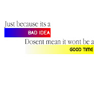
Typography Our typography project was to find quotes then to decorate/design something that makes the quote look nice. It took 1-2 weeks to complete. The main challenges I faced were finding good quotes and thinking of a good design to use for them. I learned how to download fonts while doing this project. I used my teacher and peers to help me find colors to use for some of my designs. The only changes I made to my designs were adding details. I feel like some of my designs were better then my others. I feel like if I put more time into it I could have fixed some of the worse designs. but overall I thought I did pretty well and liked my designs. Vector portrait This project was to get a picture of ourselves and make triangles over different shades of the picture to make the image. This project took about 2-3 weeks to complete. A challenge for me was trying not to make everything symmetrical without the project being crazy and all over the place. this project helped me to learn

vector portrait

Image
Pre Production I decided to use myself for the picture because I thought it would be easiest. I posterized the picture that I was using for the vector so that I could distinguish the differences in color. I made two art boards so that I could compare what I was doing to the original image. When selecting the picture I choose to take one during class because I did not have any other photos that would work. Production For this project we used illustrator. I happen to really like illustrator most things I already new but I learned how to use the graph. I usually dont oranize my workspace besideshaving the google classroom page open to the left of my adobe app. During the project i tried to make the detailed part of my face with smaller to draw more attention to it. I made the shirt and rest of my body with bigger triangles to contrast with the detailed parts. Post production I like how my final product turned out. If  I were to go back and fix it i would focus on the eyes and th

typography

Image
Pre production For this project we had to find four quotes. After we found our quotes we had to design/theme our quotes. I used a quote website to find my quotes for the fonts i went with the theme of the quote. Production For my project i had to make bees a hive and a brain with the pen tool. I did not realixe how much the alignment of the text was. That was one thing i really tried to focus on. I liked working in color a lot more because it gave me opportunities to really improve my designs. Pose production I thin that my quotes turned out good. If i were to change anything i would do a different design with one of my quotes

self performance review

Image
This project was to make a infographic about any topic we chose. I chose to do my infographic on co2 emotions from car vs hybrids. This project took over 2 weeks to complete. It took me a while to figure out what design I would use because its hard to think of a design using multiple cars and featuring text.  I learned how to use the pen tool. I added a tree because I thought it would liven up the atmosphere and put something in the background. For this project we had to use illustrator to make a raccoon. This project took around a week. One challenge I faced were the eyes. I didn't know whether to make them bigger or smaller.  Some people told me I needed bigger ears. For this project we had to make a panorama of different pictures that we took. This project took about a week including getting the pictures. A challenge for me was finding good pictures to use in my project. This project helped me learn about the selection tools and about using different layers to make a ima

Water Color Project

Image
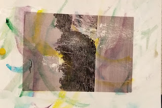
in this project we used water colors to make our picture pop. First you will need to have mod lodge, a squeegee, a cup of water, A piece of paper that is a quarter of an inch to half an inch bigger than you picture on all sides, and the picture you want. The first thing your going to do is use the water colors to make a design on the paper (cover the whole paper with your design). let the water colors dry then Put mod lodge on the picture and place it in the center of the design paper. use your squeegee to scrape any bubbles and make it as flat as possible. Let it dry then usse the water to push away the paper of your picture (be gentle). I liked this project because it was relaxing and fun to make the design. I struggled with thinking of a design to make. I also struggled to remove some of the paper from my project.

Printing Processes

Image
Relief Process One way works uses a wood cut with ink on it and then letting the ink be pressed onto the paper. You use pressure to transfer the ink to the paper. Grain in the wood allows the artist to vary the color/texture. A linoleum cut is similar to a wood cut. The linoleum cut does not dull the tools as much and prints flat black unlike the wood cut. Wood cut: Tone the block Transfer with iron oxide or carbon paper Choose white line or black line composition Cut Roll ink over the block evenly Press  Linoleum: Lay out drawing with a marker Cut Roll ink on block Press Intaglio This technique involves scratching or moving the plate. The places were it is scratched holds the ink. What you scratch is what is in ink. Etching is Scratching a way ground. In Etching you do not scratch burrs you are scratching an outline to be eaten away by acid. Dry point Scratch the surface of the plate Add tone with roulette Steel face Wipe plate with ink Lay damp pi