semester 2 Final
Typography
 Our typography project was to find quotes then to decorate/design something that makes the quote look nice. It took 1-2 weeks to complete. The main challenges I faced were finding good quotes and thinking of a good design to use for them. I learned how to download fonts while doing this project. I used my teacher and peers to help me find colors to use for some of my designs. The only changes I made to my designs were adding details. I feel like some of my designs were better then my others. I feel like if I put more time into it I could have fixed some of the worse designs. but overall I thought I did pretty well and liked my designs.
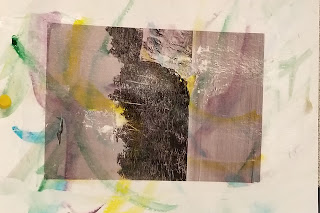
 Vector portrait
This project was to get a picture of ourselves and make triangles over different shades of the picture to make the image. This project took about 2-3 weeks to complete. A challenge for me was trying not to make everything symmetrical without the project being crazy and all over the place. this project helped me to learn ho to use the pen tool better. Some feedback I got was to make things less symmetrical and to angle my triangles to show something rather than just randomly making them. The only change that I made was not to make the logo on my shirt. I thought that my project went well if I were to change something it would be to fix the eyes and make my nose less symmetrical.
Logo
 For this project we had to make a new logo for ourselves. it took 2 weeks to complete including sketching. In this project I struggled for ideas and also finding nice fonts that I liked in time. with this project I learned that simple is better sometimes. Got feedback n most of my colors and also with ideas I should use for my logo. I changed some of the font ideas I originally had. I also changed minor details in the designs. I liked my logos a lot I think that some of them could have been improved if I spent more time individually on them.
Class time
I usually didn't finish my projects but when I did I would just keep working on them trying to improve them. I did not research much unless I was trying to do a certain thing and didn't know how to do it or wanted to make it look really good. I went over my projects before saving them to see if there was anything I needed to fix before turning them in. Th only time I could increase my e-comm skills was coming In after school with I did if I was behind or knew I would not finish on time.
Strengths
I think my strengths in E-comm come mostly form my ideas. At first they weren't as good but I think I can now weed out the bad ideas and come up with some good ideas that can make my projects look nice. I think one of my best strengths is overlaying different pictures together to make an image stand out or have a nice background to my main focus. Those are also the projects I most enjoy because of the different ways the colors blend and the background changes.
Weaknesses
I think the that my biggest weakness would be losing focus. Usually when I lose focus its very hard for me to get back on track and then I end up wasting a whole day and not completing much. I also think that sometimes I have trouble putting my ideas in to the actual designs and then instead of retrying I just settle for what I have.
Conclusion
The thing I liked the most about graphic design was the freedom to make our own projects. We didn't have to copy or all make the same thing we were able to be creative. Spend more time on some projects that are harder or involve more creativity so that we can make better designs. One goal I would set would be to get all my stuff sone on time and stay focused more. I like e-comm a lot and am excited to continue.


Comments
Post a Comment